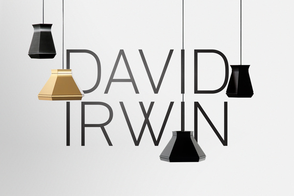
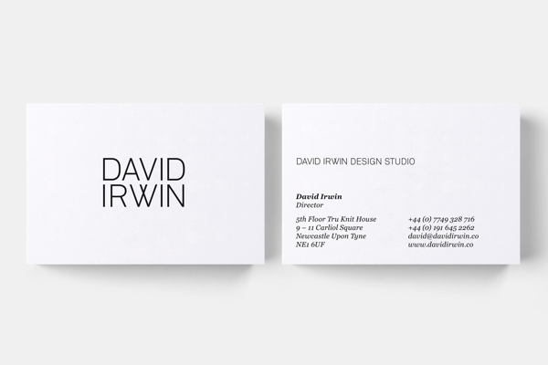
Although this is an identity for an industrial designer, the contemporary wordmark is relevant to the aesthetic Nicole wants to achieve through her branding. The letterforms are customised therefore referencing the bespoke nature of the clients work. I love the juxtaposition of the clinical and geometric letterforms of the logo with the contact details set in serif — it adds an intriguing aesthetic.
Source: behance.net


No comments:
Post a Comment