
Showing posts with label Brief 2 - Fashion. Show all posts
Showing posts with label Brief 2 - Fashion. Show all posts
Tuesday, 28 May 2013

Brief 2 - Production
More production for the Rebekah Hill identity with revised business cards and swing tickets. From die cut logos, to black foil and now blind emboss — seems like I went through every print process possible but we decided to settle on this.
Triplexed with 2 heavy weight white card stock and lightweight yellow stock on reverse.


Monday, 27 May 2013
Thursday, 23 May 2013
Brief 2 - Production
When printing out the yellow inserts, I noticed the odd couple of errors in terms of grammar — such as additional full stops or having inconsistency with the spacing and leading within the copy on the inside page.


Each of the lookbooks consists of 9 concertina pages — an absolute pain to cut and score and fold down but I'm really happy with the end result.


As the embossing went slightly wrong on the lookbook cover we decided to foil the cover as an alternative — again, it didn't come out exactly as I hoped but Rebekah was happy.


Brief 2 - Embossing
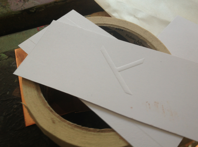
After getting my embossing plate stripped and re-exposed due to some errors in the initial process, I finally managed to get some business cards and tags embossed. I cut the card to size and began to emboss. Due to the abstract, geometric shape, I initially thought I ruined the plate due to it coming out at the wrong orientation but this ended up just being a lack of common sense. Some of the copper plate transferred onto my designs but this managed to sort itself out. With the lookbook cover, this was the size of the plate and ultimately did not emboss as well as I'd hoped. We therefore need to decide on an alternative.


Brief 2 - Yellow inserts
Using the typeface I selected for the brand (Gotham), I set about creating the half page yellow inserts which described the garments on show. I used a simply format to ensure the text did not distract from the photographs. I chose half-pages as it offered a glimpse of the clothing / photographs behind.
Tuesday, 21 May 2013
Brief 2 - Revised concertina artwork
To account for binding, I have decided to add an extra 20mm to the left margin which, due to the size, meant the entire concertina artwork had to be re-sized to fit an A3 page —
Brief 2 - Binding
After a discussion with Rebekah regarding the publication, we have decided to settle on a metal fastener bind. Due to the complication of the concertina pull-outs, this was the most logical and inexpensive way of binding the content — just one hole punch is needed — and as it is not intended to be read as a typical book (due to the pull outs) we didn't need to worry about how secure the bind is (excuse the poor mock up)


Brief 2 - Lookbook mock-up
After preparing the imagery, I decided to create a test mock-up to ensure the images are of a decent quality and the concertina artwork works with the half-pages I proposed. I am really pleased with the outcome so far but need to figure out what binding process will be most effective (due to the use of multiple concertinas). I have accounted for the bind by leaving a 10mm gap but may need to extend this depending on what I choose.


Brief 2 - Swing tickets test
This is another mock-up of the swing tickets for Rebekah — duplexed with heavy white stock and lightweight yellow stock used throughout her branding. The brand mark was foiled with black on one side and the wordmark logo printed in black on the reverse. Rebekah then inserted an eyelet so I was able to add thread. The foiled logo will potentially be blind embossed as opposed to foiled.


Sunday, 19 May 2013
Brief 2 - Concertina artwork
These are the designs for the concertina pull-outs within the lookbook. I hope to print these on a relatively light, white stock (the matte from digital dungeon) and then bind with the additional yellow inserts (for photography / make-up credits etc).
Tuesday, 14 May 2013
Brief 2 - Photography & Lookbook
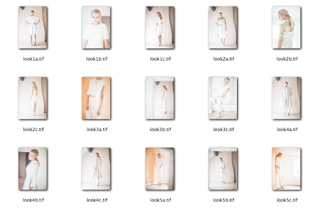
Just received the photographs from Rebekah of her collections and they're brilliant — really looking forward to working with them. The style of the photography reflects the nature of her clothing perfectly and hopefully the branding does the same. All the images have been organised by each collection / outfit in a set of 3, ready to be collated into the concertina format.

Format —
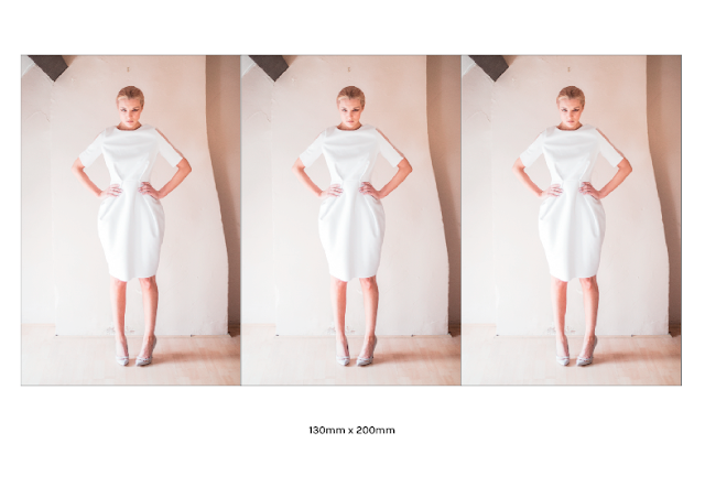
Rebekah has requested a larger size than originally intended (145mm x 245mm) but due to cost and efficiency, we decided to reduce the width to 130 to account for the concertina format — this way, 3 pages could sit nicely on an A3 document, therefore reducing the costs. 9 outfits = 9 A3's plus cover and inner stock (printed in studio therefore cheaper) = £9 per lookbook
I started to play around with the format and as I didn't want to crop the photos in any way, I decided to use the same format and orientation —
REMEMBER TO ADD 10mm ON LEFT FOR BINDING




Format —
Rebekah has requested a larger size than originally intended (145mm x 245mm) but due to cost and efficiency, we decided to reduce the width to 130 to account for the concertina format — this way, 3 pages could sit nicely on an A3 document, therefore reducing the costs. 9 outfits = 9 A3's plus cover and inner stock (printed in studio therefore cheaper) = £9 per lookbook
I started to play around with the format and as I didn't want to crop the photos in any way, I decided to use the same format and orientation —
REMEMBER TO ADD 10mm ON LEFT FOR BINDING


Thursday, 9 May 2013
Brief 2 - Logo hangers
During one of the crits, it was suggested to look at how the logo could form the hanger itself as opposed to simply applying my logo onto an existing white hanger. Rebekah is swaying more towards a monochromatic colour palette therefore it will inevitably be spray-painted white to ensure brand consistency. I looked at the sizing of an existing hanger to replicate within my own (albeit more narrow due to the form of the brand mark).


Sunday, 5 May 2013
Brief 2 - Hangers
For the meantime, I have proposed the logo to be placed in the centre of a white, wooden hanger — this could potentially be in the form of a sticker or even screen printed. I want to look at a more interesting application, so will begin to explore other avenues.


Saturday, 4 May 2013
Brief 2 - Lookbook / Publication formats
Rebekah had the photographs of her garments photographed last week so I will be able to start putting the lookbook publication together as of next week. I have a format set out — that of a concertina style pull out, interspersed with sections detailing the model, make-up artist etc. I want to explore other avenues, however, as opposed to sticking with the one I set out to do. I found these works by Shaz Madani which are each brilliant — such unique and engaging formats.
Source: smadani.com


Source: smadani.com


Subscribe to:
Posts (Atom)