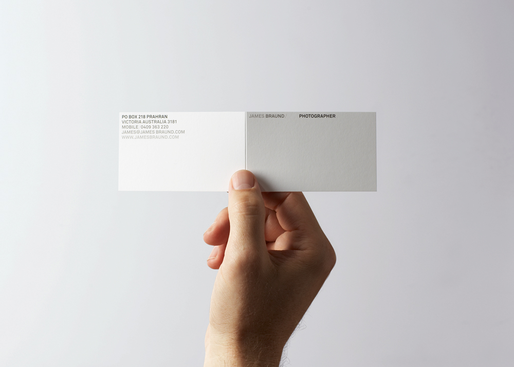
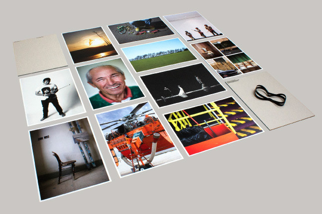
A few examples of the brilliant work by Project Projects. For the design context, design a day and my branding briefs, I am producing a publication and therefore contextual research such as this is hugely beneficial. A range of processes, formats, layout, type and so on —
Source: projectprojects.com
Showing posts with label Brief 1 - Context. Show all posts
Tuesday, 16 April 2013
Brief 0/1 - Layout inspiration
Just come across this recent design by A2/SW/HK for Aperture magazine. The flexible layout allows a range of outcomes and therefore creates an engaging publication — the heavy use of white space is particularly nice. The juxtaposition between the serif and sans serif typefaces creates an interesting aesthetic.
Source: a2swhk.co.uk
Thursday, 21 March 2013
Brief 1 - Context - Responsive web design
As Nicole wants to showcase her photography on the web and also on her ipad when visiting prospective employers, for example, I thought it would be useful to create a responsive web design that would cater to different outputs. Heydays had a brilliant example for LK Hjelle — a furniture manufacturer. I will need to explore how the web design I create will translate effectively to other screen sizes and outputs.
Source: heydays.no
Source: heydays.no
Monday, 4 March 2013
Brief 1 - Context - Fotograf Holien Mo
Fotograf Holien Mo is an alias for a Norwegian photographer "with an eye for documenting stories and moments between people". Heydays devised a tactile and sophisticated brand identity that referenced the photographers sense of craftmanship with his work. The wordmark logo is used throughout the brand collateral and forms a pattern in itself due to its triangular formation. The identity is sleek, contemporary and versatile.
Source: heydays.no
Source: heydays.no
Tuesday, 12 February 2013
Brief 1 - Context - Tom Solo branding
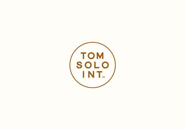
Mash Creative devised the following identity for Tom Solo, a photographer based in Frankfurt, Germany. He required a versatile and simple identity that could be applied to a range of print (and web) collateral. The circular device is intended to imitate the viewfinder of a camera and the bronze colour palette was used to convey a sense of quality. The minimal identity combined with a rich colour scheme creates an engaging aesthetic. The use of blind embossing only highlights this subtlety — a design choice Nicole wants to portray through her branding.
Source: behance.net
Source: behance.net
Thursday, 31 January 2013
Thursday, 24 January 2013
Brief 1 - Context - Daniel Hopwood
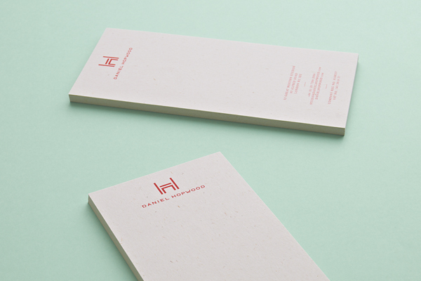
I came across this identity for Daniel Hopwood, designed by Two Times Elliott. As Nicole is after a simple, wordmark logo, I thought this would be appropriate to use as a reference. The one colour palette, although minimal in its appearance, creates a striking aesthetic. The mark and sans serif type compliments the serif text brilliantly, especially when blind embossed on the business card.
Source: behance.net
Source: behance.net
Monday, 21 January 2013
Brief 1 - Context - David Irwin
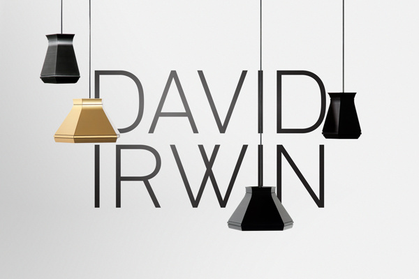
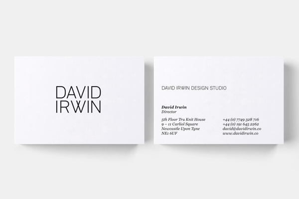
Although this is an identity for an industrial designer, the contemporary wordmark is relevant to the aesthetic Nicole wants to achieve through her branding. The letterforms are customised therefore referencing the bespoke nature of the clients work. I love the juxtaposition of the clinical and geometric letterforms of the logo with the contact details set in serif — it adds an intriguing aesthetic.
Source: behance.net
Source: behance.net
Subscribe to:
Posts (Atom)