
Showing posts with label Brief 1 - NHE. Show all posts
Showing posts with label Brief 1 - NHE. Show all posts
Tuesday, 28 May 2013

Monday, 27 May 2013
Brief 1 - Final publication
I haven't managed to blog much in regards to the publication as it has been an ongoing working process with the client. I produced a magazine for Nicole for her last module at university therefore we decided to retain the same aesthetic for this publication.
Nicole's project is centered around song titles from across the years — this ultimately informed the name, 'Era'. The type treatment on each cover photo needed to support the imagery and reflect the chosen song title.
Nicole's project is centered around song titles from across the years — this ultimately informed the name, 'Era'. The type treatment on each cover photo needed to support the imagery and reflect the chosen song title.
Brief 1 - Mailer
For Nicole's envelope design, I used white foil on lightweight black stock to ensure brand consistency (monochrome colour palette). For the letterhead, I retained the same aesthetic from the CV and other brand material which included a duplicate version of the format of her contact details.


Saturday, 11 May 2013
Brief 1 - Deliverables / Mail-out
So far, I have completed (or currently working on) —
Business card
Letterhead
Cover letter
Lookbook
Magazine
Website
After looking at the Alex Telfer branding, I wanted to look at how I could expand the brief to ensure a fully exploited brief. The mailout idea below is proposed to be white foil on black stock to emulate the aesthetic of the business card.
Mailouts — picture prints?
Envelope design for cover letters
Exhibition design (End of year show)
Physical portfolio (logo application)


Business card
Letterhead
Cover letter
Lookbook
Magazine
Website
After looking at the Alex Telfer branding, I wanted to look at how I could expand the brief to ensure a fully exploited brief. The mailout idea below is proposed to be white foil on black stock to emulate the aesthetic of the business card.
Mailouts — picture prints?
Envelope design for cover letters
Exhibition design (End of year show)
Physical portfolio (logo application)


Friday, 26 April 2013
Brief 1 - CV and Letterhead
Based on my initial designs, these are the final CV and letterhead designs which I have run by Coley. She wants to print them on a heavy white stock to ensure a clean finish. I may even try to foil the logo to add extra depth to the standard documents.
Thursday, 25 April 2013
Brief 1 - Final website (context)
Images of the final web design in context (designs approved by Coley) —


Monday, 22 April 2013

Wednesday, 17 April 2013
Brief 1 - Web development
Started to look at more interactivity in terms of roll-overs, drop down menus and image slideshows. I wanted the aesthetic to be fairly simple but with plenty of engagement by the user. I also tried a black header but the white seems to be cleaner, especially against the rich photography.


Final site (hopefully) —


Tuesday, 16 April 2013
Brief 1 - Website development
I started to explore more design ideas for Nicole's website, looking at how her photography and retouching could become its primary focus. I began by developing the previous design I created, looking at different hover states and grids. Nicole wanted a responsive web design that would change depending on what size screen or device the user was using. I found Skeleton — a web development platform which allows you to create these responsive websites.


I looked at how I could enlarge the image with a subtle white border surrounding the frame. This could then resize depending on the screen size. On first visit, the photograph would occupy the entire window and the navigation could be revealed through a tab.


When clicked (or dragged using tough gestures on phones / tablets), a navigation (including her logo) would appear. Within the portfolio pages, I hope to include arrows within the large photograph so users could easily navigate between the images. The tab would automatically hide as to not obscure the photo.

Brief 1 - Business card development
I printed some examples for the front of the business card on satin stock. I then applied these to the back of the design I previously foiled. These are just mock ups at the moment as I hope to use thicker black stock and ensure the cards are duplexed properly.


Brief 1 - Business card development
With the identity for Nicole Holcroft-Emmess pretty much finished, I decided to start on producing the business cards. First I changed the text on the back from Photo editor to Picture editor as requested by Nicole. As I proposed white ink on black, I decided to foil block the text on the reverse — luckily it worked well. The front of the business cards feature different photographs with the logo overlaid.


Thursday, 28 March 2013
Brief 1 - CV Development
Using the logo I developed, I started to generate some initial CV designs using the content Coley sent over the other day. Although I used Montserrat for the contact details on her business card, there is only one weight available therefore we've decided to use Gotham for the main body copy. She requested a sleek and modern layout design so I tried to ensure plenty of white space in a multiple column format as opposed to the one column she previously had.
Friday, 1 March 2013
Brief development
After showing some initial ideas for a couple of the briefs I've been working on to Andy, he gave me some much needed direction. For the Rebekah Hill branding, I need to ensure all design decisions are well-informed and use a multitude of material as a potential influence for the brand. He liked the following design the most as he believed it to be the most versatile. He also stated that because my branding for Nicole Holcroft Emmess (brief 1) was also fairly minimal in its aesthetic, he suggested exploring more tactile and interactive design decisions for the Rebekah branding and seeing how far I can push the brand.


Rebekah Hill to do:
1) Refine the split K concept (reinforced by how people typically spell her name incorrectly)
2) Investigate stock choices / materials etc
3) Clarify a colour palette
4)
Nicole Holcroft Emmess to do:
1) Embossing plate with logo
2) Investigate stocks (black reverse, satin? front with photo)
3) Test out embossing and / or foiling
4) Complete brand collateral (CV, letterhead etc once text is received)
5) Web design idea generation
Wednesday, 20 February 2013
Brief 1 - Final business card
As Nicole wanted to feature her photography on the back of the business card, I thought I could incorporate several images and apply the wordmark logo. The text on the back of the design uses the same placement and width of the logo on the reverse.
Spec —
In terms of printing, I will experiment with a couple of options (both duplex) The back (text) will remain the same, with white foil on heavy duty black stock and the other side will either be printed on satin or matte stock, depending on Nicole's preference. She aims to become a photo editor for magazines therefore a satin stock may be more appropriate, especially when showcasing the vibrant colours in her work.

Spec —
In terms of printing, I will experiment with a couple of options (both duplex) The back (text) will remain the same, with white foil on heavy duty black stock and the other side will either be printed on satin or matte stock, depending on Nicole's preference. She aims to become a photo editor for magazines therefore a satin stock may be more appropriate, especially when showcasing the vibrant colours in her work.

Brief 1 - Business card development
After reflecting on some of the initial designs I created, I decided to avoid using a serif typeface as it was difficult to find a natural balance — plus, Nicole requested a stripped-back and contemporary aesthetic so a sans-serif typeface seemed more appropriate. Although only available in one weight, I decided to use Montserrat due to its clean and simple form. Montserrat is also available as a Google web font so I am able to integrate the font into Nicole's website (source) to ensure brand consistency.


Brief 1/3 - Stock
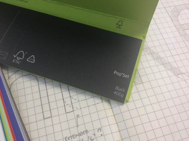
Andy brought in some stock samples as me, Max and Yaf were looking for stock choices for our Form and writing stationery. We had initially used a muted colour palette within our branding for OUGD301 and as we liked the aesthetic, we decided to use a similar palette. Arjowiggins offers an extensive range of paper and pride themselves on their eco-sustainable approach. We liked the textured aesthetic within some of the Keaykolour range and they offset well with the Spring Green from the Pop Set. I also looked at black stock for Nicole's branding.
Spec — 120gsm
Source: arjowigginscreativepapers.com




Spec — 120gsm
Source: arjowigginscreativepapers.com


Subscribe to:
Posts (Atom)