I managed to source some fairly high quality photographs for the two studios in which I was missing content for. I then went to print the second half of the publication after ensuring the copy, including page numbers, was correct throughout.

Showing posts with label Brief 0 - DC Publication. Show all posts
Showing posts with label Brief 0 - DC Publication. Show all posts
Monday, 6 May 2013

Friday, 26 April 2013
Brief 0 - Print
Was only able to print half of the inners due to print slot times but will able to get the rest printed text week (works out great as I'm still yet to source images for the final 2 studios). Crop marks are still intact until I print the rest of the publication and am ready to bind.


Brief 0 - Final publication
Final context publication minus the content for 2 studios as I am just awaiting more hi-res imagery.
Monday, 22 April 2013
Brief 0 - Publication development
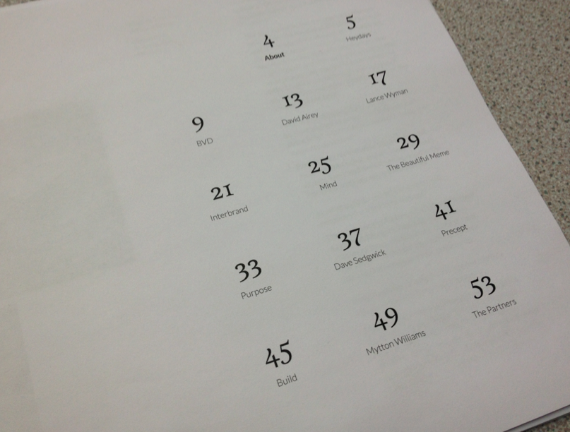
My stamp arrived which is ace (ignore the shoddy tests though), and I have printed some mock ups of the introductory pages. Will hopefully get the layout sorted and finalised by the end of the week and the cover stock will be arriving at around the same time.



Tuesday, 16 April 2013
Brief 0 - Publication stocks
Will hopefully be getting some stock from GFSmith soon which is brill (Cheers Amber). I chose to source some for this project in particular as I will be hand-crafting the publications and potentially sending them out to some studios. I looked at the range of greys GFSmith had to offer based on my initial design (below). I eventually chose:
Pale Grey
540gsm
510x770mm


Pale Grey
540gsm
510x770mm


Brief 0 - Layout proofing
I printed out the content pages so far to check for grammatical errors as well as ensuring the images are of a decent enough quality. I also missed out some copy (sourcing of some of the images). Some of the images aren't so great in terms of quality as I pulled them from the internet so I need to revise the ordering / selection.


Thursday, 11 April 2013
Brief 0 - Layout so far
Still some alterations to go, but this is the layout of the content pages as of now (8 studios / designers — still 5 to go). I used a fairly rigid structure but due to the varying image layouts, I had to utilise the grid to ensure clarity. The images featured on the 'title' pages were used as a reference to the text so readers could clearly relate to the content. I also separated the '3 words...' question as I believe this encapsulates what the studio believes a brand needs to be or what approach they utilise.
Brief 0 - Layout development
Looking at different ways of setting type — To reference the images, I used vertical orientated text towards the left of the text. I will be spreading the content for each studio over 4 A5 pages. The first will feature the name of the studio along with a couple of images followed by the questionnaire response on the second page, followed on to the third if necessary.


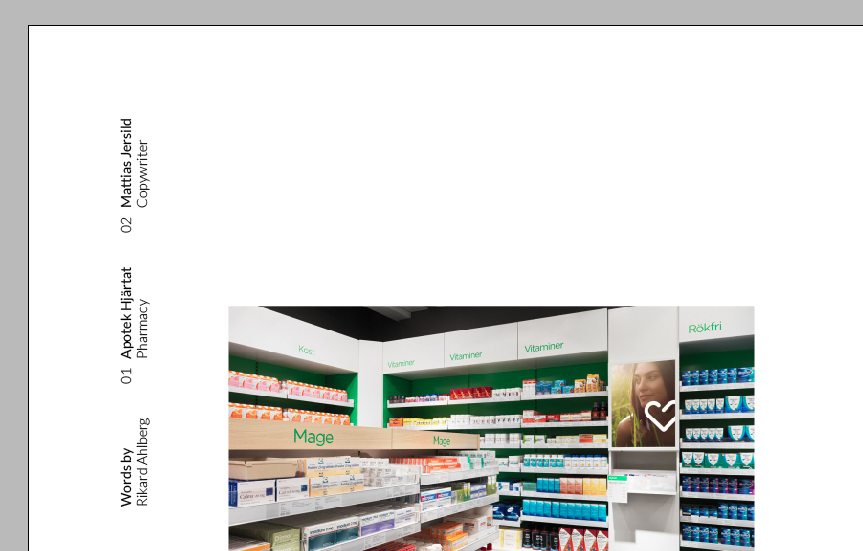
Differentiation between question and answer using two weights of Lato —

Wednesday, 10 April 2013
Brief 0 - Layout development
Experimenting with type setting — I originally had the idea of having the questions inset slightly from the outer margin to differentiate the content between question and answer and reinforced this using a lighter weight of the font. I used Lato as this was the same font used within my online questionnaire and I wanted to ensure consistency.


I started to look at the composition of the text in relation to imagery and headers. I'm unsure as to whether just to include text on the introductory pages or intersperse the text with imagery.

Extending inner margins to account for binding —


Monday, 8 April 2013
Brief 0 - Stamp?
As the cover will simply consist of the registered trademark symbol on a chosen stock, I thought I could reduce the costs of printing and ease production by getting a stamp produced. Using the English Stamp Company, a 20mm x 20mm stamp would come to £10 — not too bad. I also looked at whether the format of the symbol could be replicated within the contents page of the publication (still unsure at this point).


Brief 0 - Cover development
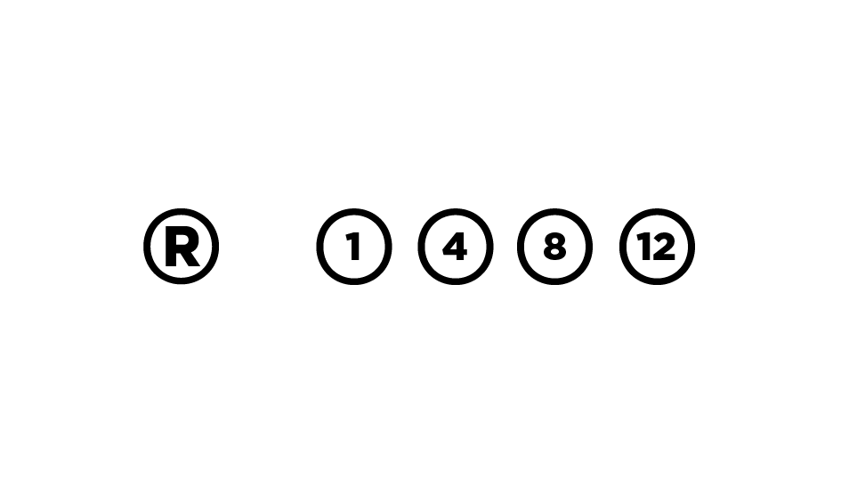
I have been developing and working on a design for the cover of my context publication. I already had a colour palette (sort of) clarified and decided I could utilise this within the publication itself. I looked at various ways of communicating the basis of the content — branding. I am leaning towards the design with the registered trademark mark. A logo typically features this mark towards the top right of the design so I intend to emulate this on the cover of the publication — in a way, branding the book itself.


I used these two publications to show the colour palette I intend to use. The salmon / red (whatever it is) could be buckram to bind the heavy, light grey stock for the cover. I will head down to the print resource and see what colours are available and then source the stocks for the entire publication. I will need to produce these myself to reduce costs when commercially printing.

Subscribe to:
Posts (Atom)