
Showing posts with label Brief 5 - Prospectus. Show all posts
Showing posts with label Brief 5 - Prospectus. Show all posts
Tuesday, 28 May 2013

Saturday, 4 May 2013
Brief 5 - Layout order development
We are currently in the process of sourcing all the relevant photography by contacting all tutors from across the college, both at Blenheim and Vernon. We were set to create an initial layout order for the prospectus to envision how the publication would be read. The prospectus is a little different this year as they intend to directly split the HE from the FE courses to ensure that the university is known as a HE university. This is our process — by dissecting the old prospectuses, we were able to see the general running order and what needed re-jigging and elements that needed to be removed / added.


It took a couple of hours until we were happy with the general layout — sticky notes came in handy when we had to re-order some of the elements but we are ready to show these to Chloe at marketing.


Brief 5 - Prospectus
I have realised that I haven't posted about us winning the prospectus pitch along with Max and Niall so thought it was about time to do so. The marketing team were fond of our concept that ran through the publication and the layout of Max and Niall's pitch therefore decided for us to join forces.
We refined and created a joint pitch to present to the senior management, including the principal (below) which was received well. We want the prospectus to focus on what prospective students would experience at the university. The photography is of a huge importance as it ultimately needs to reflect our direction. As opposed to outsourcing, we and the marketing team decided it would be beneficial to use a student at the college — Ben Harris is a 2nd year photography student whose style is largely documentary and therefore best reflects our intended approach.
We refined and created a joint pitch to present to the senior management, including the principal (below) which was received well. We want the prospectus to focus on what prospective students would experience at the university. The photography is of a huge importance as it ultimately needs to reflect our direction. As opposed to outsourcing, we and the marketing team decided it would be beneficial to use a student at the college — Ben Harris is a 2nd year photography student whose style is largely documentary and therefore best reflects our intended approach.
Wednesday, 1 May 2013
Brief 5 - Pitch to senior management
After collating and merging our concept and layout ideas, we generated the presentation for our pitch to senior management. This included info regarding initial layout concepts and the ways these could be utilised, potential cover designs and what we can each contribute to the project. We also showed various stock choices to see which they preferred.
Monday, 22 April 2013

Saturday, 2 March 2013
Friday, 1 March 2013
Brief 5 - Prospectus spreads
This document showcases the development in the layout. We retained a simple but versatile grid that could allow for differentiation between information and course pages. We maintained the 'We are' concept through the headers as to somewhat 'answer' the question on the cover and used the same typeface (ITC Serif gothic).
Brief 5 - Prospectus pitch covers
After clarifying our 3 concepts, me and Luke began to devise a range of cover ideas. The document below shows my personal development (Luke's will be on his blog) which we then later printed and refined.
1) Size matters
2) Make your mark
3) Do you know who we are? (to be later "answered" within the publication)
As the size matters concept centered on a playful tone of voice, we thought this could be reinforced by the colour palette, size and its composition on the page. The make / stamp your mark ideas (holes) are proposed to be die scored holes which could be pushed out by the user (inspired by these) whereas the others featuring a bunch of letters are imagined to be stickers which the recipient could interact with.
1) Size matters
2) Make your mark
3) Do you know who we are? (to be later "answered" within the publication)
As the size matters concept centered on a playful tone of voice, we thought this could be reinforced by the colour palette, size and its composition on the page. The make / stamp your mark ideas (holes) are proposed to be die scored holes which could be pushed out by the user (inspired by these) whereas the others featuring a bunch of letters are imagined to be stickers which the recipient could interact with.
Brief 5 - Context - Make your mark
For one of the concepts for the prospectus pitch, we had the idea of the recipient having control of the cover as believed an interactive publication would ultimately be more engaging. I gathered some contextual research which supported the concept.
MeBox (Graphic Thought Facility)
"A retail product designed and produced by GTF. The ends of each box consisted of a grid of perforated discs that could be pressed out to create initials, numbers, symbols and texts. When assembled, the double-thick construction showed the message against the contrasting colour of the box lining."
Source: graphicthoughtfacility.com

Source: heydays.no


MeBox (Graphic Thought Facility)
"A retail product designed and produced by GTF. The ends of each box consisted of a grid of perforated discs that could be pressed out to create initials, numbers, symbols and texts. When assembled, the double-thick construction showed the message against the contrasting colour of the box lining."
Source: graphicthoughtfacility.com

Studio Hansen (Heydays)
(cheers matt)
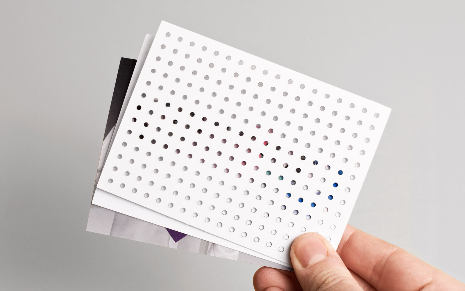
Brilliant branding by Heydays for Studio Hansen — perforated discs on the business cards allowed the recipient to form their own design / symbol / image. "By using the dotted grid as an identity element we wanted to communicate the studio through the precise appearance of the grid and as blank canvas in itself."
Source: heydays.no

Wednesday, 20 February 2013
Brief 5 - Prospectus concept
As me and Luke intend to start our own collaborative practice, we thought it made sense to both go for the prospectus pitch. We started to generate a range of concepts based on the brief that got sent out which we later refined and finalised into 3 main concepts that we believed had longevity.
We first outlined the briefs and the key message/s in which the college wanted to portray through the prospectus. We also clarified the audience and what they hoped to achieve within the design.


They requested between 1 and 3 concepts so we decided to explore and expand the current "We are..." concept alongside 2 others. We generated a range of ideas, both related and unrelated to later refine. As they pushed for a strong, innovative and unconventional concept / design, we selected the ideas that we believed could be translated well within the college 'brand'.


Final concepts
1) Do you know who we are?
This could then be 'answered' within the publication and brand collateral e.g.
"We are more than just a college"
"We are Printed Textiles"
"We are here"
"We are influential"
2) Make your mark
This concept is based on interaction. Recipients of the prospectus can 'create their own cover', through stickers, for example. This could also be incorporated with the "We are..." concept but we will explore this when it comes to design generation.
3) Size matters
A playful concept influenced by how the college prides themselves on the small nature of the institution. A small college offers many benefits — small courses meaning more tutor contact being one of them.
Subscribe to:
Posts (Atom)