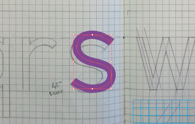
Due to the difficulty of the s letterform and the geometric aesthetic I aimed for, I decided to use a single stroke width for the lowercase s. I keep altering the anchor points and curves to try and achieve a continuous and fluid curve.
As I avoided using the angular bisect of the ascenders and descenders within the font, I decided to avoid any other sharp angles throughout the letterforms — this included the base and top of the 'z'. As opposed to continuing the diagonal stem to the base, I decided to cut it half way, as shown below, to create a more balanced and rigid aesthetic.
I made a font???


No comments:
Post a Comment