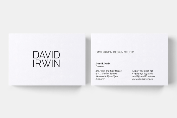
Although this is an identity for an industrial designer, the contemporary wordmark is relevant to the aesthetic Nicole wants to achieve through her branding. The letterforms are customised therefore referencing the bespoke nature of the clients work. I love the juxtaposition of the clinical and geometric letterforms of the logo with the contact details set in serif — it adds an intriguing aesthetic.
Source: behance.net
Monday, 21 January 2013
Sunday, 20 January 2013
OUGD303 - Briefs so far
I decided to remove the YCN lego project as I was already taking on too much and me and Steph intend to do the ISTD Food for Thought brief. (I can always go back to this later on in the FMP if I have some time left, however).
1) Nicole Holcroft-Emmess branding
Tags —
Brief 1 - NHE
Brief 1 - Context
2) Yearbook (yet to be decided)
Tags —
Brief 2 - Yearbook
Brief 2 - Context
3) Rebekah Hill branding
Tags —
Brief 3 - Fashion
Brief 3 - Context
4) Form and writing
Tags —
Brief 4 - Fw
Brief 4 - Context
5) Reel magazine
Tags —
Brief 5 - Reel
Brief 5 - Context
6) Formula (Creative Network, National Rail)
Tags —
Brief 6 - Formula
Brief 6 - Context
7) Food for thought
Tags —
Brief 7 - Food
Brief 7 - Context
8) Design a day
Tags —
Brief 8 - Book
Brief 8 - Context
1) Nicole Holcroft-Emmess branding
Tags —
Brief 1 - NHE
Brief 1 - Context
2) Yearbook (yet to be decided)
Tags —
Brief 2 - Yearbook
Brief 2 - Context
3) Rebekah Hill branding
Tags —
Brief 3 - Fashion
Brief 3 - Context
4) Form and writing
Tags —
Brief 4 - Fw
Brief 4 - Context
5) Reel magazine
Tags —
Brief 5 - Reel
Brief 5 - Context
6) Formula (Creative Network, National Rail)
Tags —
Brief 6 - Formula
Brief 6 - Context
7) Food for thought
Tags —
Brief 7 - Food
Brief 7 - Context
8) Design a day
Tags —
Brief 8 - Book
Brief 8 - Context
OUGD303 - FMP Group Tutorial
Prior to the tutorial I wasn't 100% on what briefs I should choose and whether I was doing too many collaborations. I outlined all the briefs I had proposed and they were received well. It helped clarify what I hoped to achieve through the FMP and that I want to specialise within branding. I have 8 set briefs, excluding the yearbook brief (as this is yet to be finalised) with the option to also do the EOYS proposal. It was suggested to complete the Formula branding project in the PPD module and choose to do another collaboration under a "Formula" umbrella.
I went in thinking to combine the two branding briefs (Rebekah Hill and Nicole Holcroft-Emmess) but as I intend to design and develop a publication for both of these briefs, it was suggested to treat them as two substantial briefs due to the amount of work I will put into them.
OUGD303 - FMP Preparation form
It was clear from looking back at previous projects that branding was my main interest and is an area of design I definitely want to pursue. Luke and I intend to open a collaborative practice after university, focusing primarily on brand design for small and upcoming businesses therefore branding will form most of the briefs. We will work on a certain amount of projects together whilst also working towards our individual practices.
Friday, 11 January 2013
Brief 1 - Initial meeting
Today I met up with Coley to discuss how she envisioned her brand to look and what needed to be considered within the design. It was clear we both had a similar direction in terms of design aesthetics, notes of which are below. She has asked for a complete brand identity consisting of a logo design, business card, letterhead and website alongside a professionally printed publication featuring her work completed during the FMP.
Notes —
Name - Nicole Holcroft-Emmess Photo / NHE
Domains - nhephoto.com AND nicoleholcroftemmess.com
Approach —
Simple
Clean
Contemporary
Modern
Black and white
Sans serif type
Bold / striking
Deliverables include —
Brand identity
Business card
CV design
Website (iPad and iPhone friendly)
Letterhead and stationery
Magazine (cover - gloss, inside - satin)
Notes —
Name - Nicole Holcroft-Emmess Photo / NHE
Domains - nhephoto.com AND nicoleholcroftemmess.com
Approach —
Simple
Clean
Contemporary
Modern
Black and white
Sans serif type
Bold / striking
Deliverables include —
Brand identity
Business card
CV design
Website (iPad and iPhone friendly)
Letterhead and stationery
Magazine (cover - gloss, inside - satin)
Brief 2 - Beauty in the making
In terms of the art direction of the photography, we took inspiration from the Beauty in the Making exhibition by GFSmith, designed and curated by MadeThought. With the photography in the yearbook, we proposed juxtaposing the visual aesthetic of the industrial surroundings we work in (the university) with clean, bright and vivid photography of students work. We intend the publication to be heavily image-based.
We loved the idea of presenting the yearbooks in a similar way to how GFSmith presented their paper (and signage) due to its imposing nature — it's visually eye-catching and unusual to see. The photography of the exhibition itself is minimal but effectively lit.
Brief 6 - GD yearbook concept
As a group, we got together over the break to begin generating ideas and concepts to ultimately put the concept board pitches together. After initial talks, we set upon the idea of treating the entire year group as a unit as opposed to having individual pages per student — in turn, this decreases the amount of pages due to the more refined and focused content. Due to the more limited amount of pages, the budget would allow us to look at various specialist print processes to create a more imposing, engaging and tactile aesthetic.
V
As it is the 5th year of the course and also the 5th and final year of our current degree programme, we thought it would be interesting to explore and develop this within the publication. Charlotte came up with the idea of a roman numeral, "V" symbol which would act to brand and encompass our year. To counter the idea of removing individual pages per person, we proposed to have a categorisation system of 5 design disciplines which each person would choose to contribute to. This would be accompanied by an index, referencing the students work and their contact details.
V
As it is the 5th year of the course and also the 5th and final year of our current degree programme, we thought it would be interesting to explore and develop this within the publication. Charlotte came up with the idea of a roman numeral, "V" symbol which would act to brand and encompass our year. To counter the idea of removing individual pages per person, we proposed to have a categorisation system of 5 design disciplines which each person would choose to contribute to. This would be accompanied by an index, referencing the students work and their contact details.
Visual direction
We wanted the aesthetic of the yearbook to be visually imposing and striking. To reference the idea of our year being a solid unit, we thought to reference this with print production. We intend the publication to be monolithic and unified in its presentation through the use edge printing in the same colour as each face of the publication — in turn, this will create a solid block of colour.
Subscribe to:
Posts (Atom)