Friday 29 March 2013

Brief 0 - Response - David Airey

David Airey is a British designer who specialises mainly in identity design as opposed to creating a full and extensive brand. I have followed his blog for a few years and his posts have always been insightful — offering advice on education, resources and employment for designers.


Shrewsbury identity

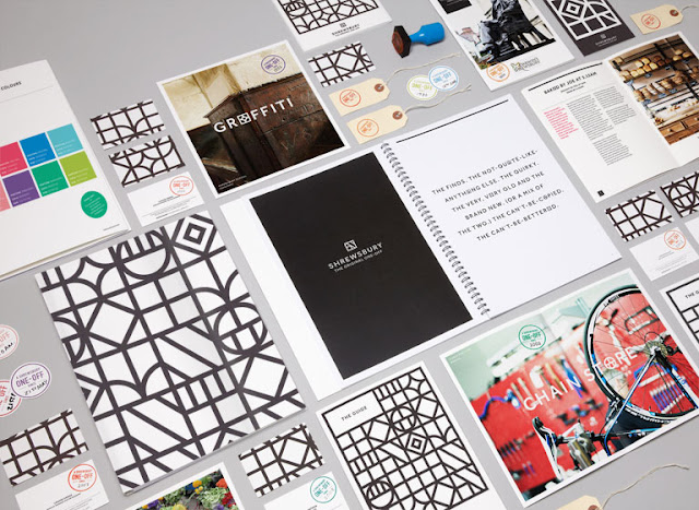
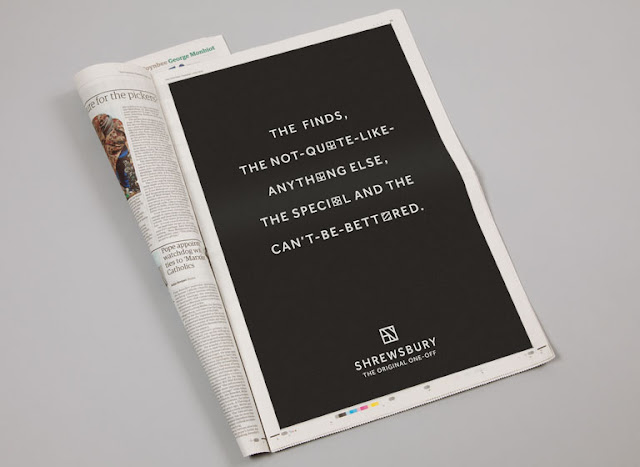
David Airey in answer to what his favourite brand identity was from the past 2 years, mentioned this design by &Smith for the town of Shrewsbury. I have seen this a couple of times online and thought it was brilliant — it's rare you see such a coherent and good looking brand for a town (if ever).


Thursday 28 March 2013

Brief 0 - Response - BVD

BVD
bvd.se

BVD believe that "dia­logue, hon­esty, inclu­sion and hard work are key ele­ments when cre­at­ing good and last­ing design." Much like Heydays, their work is clear in its approach and simple in its form — "simplify to clarify".


Stedelijk Museum

Mevis & Van Deursen devised the following rebrand for Stedelijk Museum Amsterdam. Although slated by many, it was also appreciated by many, including BVD.

Source: underconsideration.com/brandnew


Brief 0 - Response - Heydays

As I need to organise and collate all the content, I decided to organise by studio and source all the relevant imagery. I want to include images of their own work, mainly the project referenced in the answer to what brand they are most proud of and potentially images they also referenced within the answers to the other questions — favourite nostalgic brand and favourite brand design from another designer / studio.

Heydays
heydays.no

Heydays are an Oslo-based design studio that "creates strong visual concepts that trigger curiosity, create excitement and show ambition". They "remove noise to add value". One of my favourite design studios, these were top of my list of people to contact and I was chuffed to see them being the first to reply. Their approach to branding is particularly insightful:

"The goal is similar, but our approach depends on budgets and the size of the client. Our main goal in our search for the correct solution for our client is to get to know them properly. We map how they describe themselves, and look for clues and interesting information that can transform their brand into the next level. After listening, we challenge. We talk about opportunities and other ways to look at it. The answer is in the brief."



Brief 0 - Responses

So far I've got responses from the following studios and designers. Really pleased with the amount that have replied — the answers are great — really insightful answers. Also, I wanted to try and contact studios big and small, local and abroad to ensure diverse and varied content and so far it has worked out. I am particularly pleased to have heard back from Lance Wyman who created the Mexico '68 Olympic branding — one of my favourite brand designers. Hopefully I can keep a dialogue with some of those who responded.

The Beautiful Meme - York
Build - London
BVD - Sweden
Dave Sedgwick - Manchester
David Airey - Ireland
Heydays - Norway
Interbrand (Australia) - Sydney
Lance Wyman - New York
Mind - London
Mytton Williams - Bath
The Partners - London
Precept - Newcastle
Purpose - London


Brief 1 - CV Development

Using the logo I developed, I started to generate some initial CV designs using the content Coley sent over the other day. Although I used Montserrat for the contact details on her business card, there is only one weight available therefore we've decided to use Gotham for the main body copy. She requested a sleek and modern layout design so I tried to ensure plenty of white space in a multiple column format as opposed to the one column she previously had.


Tuesday 26 March 2013

Brief 0 - Presentation

Design context presentation – Started off with one of the responses I received from Holger Jacobs at Mind. I talked through the basis of the publication, the content (questionnaire responses) and the format in which I intend for it to be presented (A5 print format). I will begin to explore print and binding processes and ultimately design the publication after collating the rest of the content.


Monday 25 March 2013

Brief 0 - Context - Victionary

These publications by Victionary are insane (-ly brilliant). They have collated various graphic references on a specific theme — gold and silver, multicolour, geometrics and black & white. Each design is unique in its form, particularly the gold and silver publication. As a result of the limited amounts of text, the images become its primary focus.

Source: victionary.com


Brief 0 - Context - Methodist church review

Brilliant work as usual by Maddison Graphic.

Source: maddisongraphic.com