Tuesday 26 February 2013

Context - New Theatre

Interbrand Australia created this identity for New Theatre, an independent theatre located in Sydney with over 80 years of rich history. Their ethos celebrates alternative theatre and therefore its rebrand needed to celebrate this asset. At the heart of the rebrand is a logomark consisting of the letter T derived from the main wordmark and the letter N. The idea of always 'trying new things' is referenced in the mirrored structure of the mark and its available applications, as showcased in its brand collateral e.g. Theatre open / Theatre closed — a great concept executed brilliantly (one of my favourite brands).

Source: standapart.com.au


Brief 2 - Logo development

After revisiting the Rebekah Hill logo, and based on the feedback I got during the crit, I decided to explore other design ideas, prior to a meeting on wednesday. I looked primarily at wordmark logos, looking at how I could incorporate some aspects of Rebekah's work — layering, minimal aesthetic, contemporary, negative space and subtle embellishment — to create a bespoke wordmark logo.


Some larger previews —


Brief 2 - Context - ArtFad

These custom and bespoke invitations for ArtFad were designed by Hey Studio. Each invite was composed of two different colour threads creating unique colour combinations. It creates a more tactile and engaging aesthetic, something which I intend to utilise within the Rebekah Hill fashion branding.

Source: heystudio.es


Brief 2 - Context - Whyte Lilja


Source: kurppahosk.com


Wednesday 20 February 2013

Brief 2 - Context - Maeven

Maeven is an online clothing retailer specialising in vintage and preowned designer clothing. Lotta Nieminen designed their brand identity using a distinctive colour palette, reminiscent of the products they sell. The angular aesthetic of the wordmark logo is referenced through the stationery ensuring brand consistency throughout. The use of a subtle pattern within some of the branding elements is something I intend to explore through the branding for Rebekah.

Source: lottanieminen.com


Brief 1 - Final business card

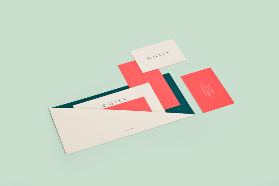
As Nicole wanted to feature her photography on the back of the business card, I thought I could incorporate several images and apply the wordmark logo. The text on the back of the design uses the same placement and width of the logo on the reverse.

Spec —

In terms of printing, I will experiment with a couple of options (both duplex) The back (text) will remain the same, with white foil on heavy duty black stock and the other side will either be printed on satin or matte stock, depending on Nicole's preference. She aims to become a photo editor for magazines therefore a satin stock may be more appropriate, especially when showcasing the vibrant colours in her work.


Brief 1 - Business card development

After reflecting on some of the initial designs I created, I decided to avoid using a serif typeface as it was difficult to find a natural balance — plus, Nicole requested a stripped-back and contemporary aesthetic so a sans-serif typeface seemed more appropriate. Although only available in one weight, I decided to use Montserrat due to its clean and simple form. Montserrat is also available as a Google web font so I am able to integrate the font into Nicole's website (source) to ensure brand consistency.


Brief 1/3 - Stock

Andy brought in some stock samples as me, Max and Yaf were looking for stock choices for our Form and writing stationery. We had initially used a muted colour palette within our branding for OUGD301 and as we liked the aesthetic, we decided to use a similar palette. Arjowiggins offers an extensive range of paper and pride themselves on their eco-sustainable approach. We liked the textured aesthetic within some of the Keaykolour range and they offset well with the Spring Green from the Pop Set. I also looked at black stock for Nicole's branding.

Spec — 120gsm

Source: arjowigginscreativepapers.com


Brief 1 - Business card development

Nicole requested to feature a photograph on the back of her business cards so I started to look at how her logo could be integrated within the business card designs. I wanted to create a juxtaposition of the sans-serif, stripped-back wordmark logo with her contact details / information set in a serif typeface.


Business card ideas —